Tuesday, April 3, 2012

Introduction

This is a Reflective Folio which consists of :
- Controversial ads
- Brand Based Ads
- Retail ads
- Direct Response Ads
- Business to Business Ads
- Not for profit Ads
- Global Ads

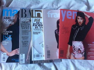
As well as Online Ads and YouTube Videos I was lucky enough to get free print media from Loreal Melbourne fashion Week and ACP Printworks expo.as well as using direct response ads which i have collected throughout the years.

magazines from ACP April 2012
summary of magazines
loreal melbourne fashion festival magazines March/April 2012
 As well as the magazines i have a box of print ads which i have been collecting for a while since i do the occasional 21st, 18th birthday invites for people it gives me creative ideas and also helped me with this folio.

Stage 1 - Controversial Marketing Ads - Marc jacobs Oh Lola


  • This is an Ad for Marc Jacobs Perfume “Oh Lola” which is modeled by celebrity Dakota Fanning.
  • The ad would be seen in usually high end fashion magazines such as Vogue, Vanity fair, Harpers Bazaar, Cosmopolitan and Shop till you drop.
  • The intended audience for this ad would be women ages 16 to late 30s which most of these magazines are target to.
  • The message of this ad is that Sex sells and if you use Lola you too could be living the beautiful life like a celebrity.
  • With the pink background and other colors of the similar shades suggest this ad is for women
  • The key objects in this ad are A young girl and a bottle of perfume.
  • The celebrity used in this ad is actress Dakota Fanning who is best known for her child roles in “I am Sam”, “Man on fire” &“Hide and Seek”.
  • The positioning of the ad has Dakota Fanning Holding a bottle of Marc Jacobs in-between her legs which has been said to be a promiscuous position.
  • As Dakota Fanning’s fame arose from playing young daughters in movies, her perception as an actress is seen as the same way (little girl even though she is grown up).
  • The ad is sexed up by having her place the bottle in the postion she is holding it in.
  • She is resting on one hand which is behind her and has the other hand holding the bottle inbetween her legs with her dress slightly moved up.
  • Her facial expression also adds to the factor that she is being sexy.
  • The only text in the ad is the text on the bottle and on the white border of the image
  • if they used the other images from the campaign which can be seen above there wouldn't be any objection and the ad wouldn't of gotten banned. 
  • Marc Jacobs is always known for making a statement so its no surprise he went for something more risky
Considering the first Lola Ads were done very classy it could be said he decided to pick that actress and pose as he wanted a younger market for the "Oh Lola" perfume


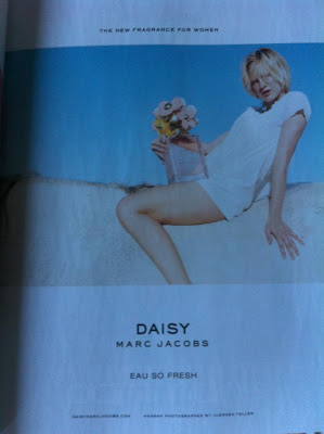
He also used the same pose for His Daisy perfume which i found in The new Shop till you drop magazine April 2012 which has a older looking model. this is smart as it will make people think of the Lola Ad soon as they see it as it was linked to controversy but when they look closer they can see its for a different perfume and ad all together


    Article

    Stage 1 - Controversial Marketing Ads - Rip & Roll


    • This ad is a safe sex ad for HIV aids called “rip and roll”
    • The ad was placed at Brisbane bustops
    • The ad is mostly black and white with only one other other in it. The red item the man is holding is also the same colour as the ‘&’ in the Rip and Roll logo. Which draws a lot of attention
    • The intended audience is for gay males who are engaging in sexual activities.
    • The message of the ad is to raise awareness and to becareful.
    • The male who is behind is shown to have a wedding ring which shows this couple is serious long term and are in love.
    • If this was an ad with a man and a women there would not be as much attention to it and would not be seen as controversial.
    • The two men in the picture are showing affection but there is nothing x-rated about their positions
    • They look happy to be with each other
    • This ad is appealing to fear. If you are not careful you could loose your loved one.
    • As a lot of people still do not think homosexual lifestyle is a acceptable in the society it raises’ questions of controversy.
    • People might think ads like this might influence more people to open up about their sexual preferences.
    • Even seeing two gay men kiss on the street might be seen as disturbing to some. 

    stage 1 - Controversial Marketing Ads - Cockatoo Ridge Wines


    • This ad is for Cockatoo Ridge Wines with Model Erin Mcnaught.
    • The ad was placed at a massive Billboard on Bourke St Melbourne.
    • Erin is seen in a blue and white-checkered shirt with the buttons undone revealing some cleavage
    • The intention of this ad is to sell wine by sexing it up.
    • The picture looks like its set out in the outback with the sun hitting the models face.
    • There is a cockatoo on her shoulder, which coincides with the label of the wine company
    • The facial expression on the models face is very flirty as well which also adds into the fact that sex sells
    • The slogan in the ad which says “she loves a cockatoo” is a play on words and is considered controversial
    • The slogan text is bigger then the brands name which is written in a much smaller font below.
    • The ad suggests that the model is promiscuous.
    • According to articles the model was not aware by the sexualization of the ad which could threaten the reputation of the model who hasn’t had any controversy in her modeling career.
    • Even placement of the ad was clever as from some angles such as the image on ___ you can only see the word cock. Which would catch peoples attention in the busy intersection of bourke and swanston streets 

    Stage 1 - Controversial Marketing Ads - Axe deodorant


    • In the video you see a young man in the bathroom and after he uses the product he turns into a chocolate man.
    • The intention of this ad is to say women wont be able to resist men after they use this product just like how they cant resist chocolate.
    • The intended audience is young males who want to get girls. Maybe ones that are currently hitting puberty
    • The ad is sexed up a little bit but uses a great deal of humor also.
    • The ladies in the video are all mesmerized as the guy walks past and there is some slow Barry White type music playing in the background, which also adds to being a bit cheeky.
    • The chocolate man himself looks very cartoonish doesn’t look tasteless at all. If he was a topless with a 6 pack then the ad could have been more questionable
    • You see the man walk past the two ladies ripping off his nose to sprinkle their ice cream cones and you see his hand in the present he gives to a patent in hospital
    • In India they tried banning the ad. Culture might be a factor to why the ad was considered controversial as public displays of affection such as holding hand, kissing is forbidden
    • In saying that its funny as if you ever go to countries where the culture is like that the local men/males in the country are the ones who stare, wink and shout out cheap pick up line comments as you walk past the street so its bizarre how they find it offensive just because a different gender is behaving in that manner.  

    Stage 1 - Controversial Marketing Ads - Carls Jr Burgers


    • Paris Hilton is heir to the famous Hilton hotels which are found all over the world.
    • Her reputation is also known all over the world. But not in a good way.
    • Shes known for her partying, shopping and that sex tape she made called One Night in Paris
    • Reality tv shows like the simple life and my new BFF. Which shows her ditzy blonde stereotypical personality.

    • The audience for this ad is men who enjoy a good burger and like Paris Hilton.
    • The ad can be seen in print and video mediums.
    • The tv ad was recorded for the superbowl and was banned due to being to sexual.
    • As Superbowl is mostly watched by males, it could be said why Carls Jr picked to do such a sexy ad
    • burgers are eaten by People of all ages and sexes so i don't think they went about the campaign in a good way.  
    • The print ad has the slogan saying "She'll tell you size doesn't matter. Shes lying" which would make most people think about her Sex tape that made her famous world wide.

    Stage 2 - Branding

    A brand is a "Name, term, design, symbol, or any other feature that identifies one seller's good or service as distinct from those of other sellers." Just by looking at the following ads you know what they sell just by looking at their brands logo.


    All the Safeways in Melbourne have gone through a major brand change into the 'Woolies' name. But just because the name changed doesn't mean the service has. They still have their "fresh food people" slogan which they had in the past. Also the new Logo of the W representing Woolworths looks like a green apple which also represents freshness.


    Trade Press Article


    Woolworths has fired off the latest salvo in the 'freshness' war with rival retailer Coles, as it launched a refund and replace campaign.The ad follows up on the traditional positioning of the supermarket as the "fresh food people," by claiming that "we've always been obsessed with fresh food. Now, we guarantee it".It has launched the campaign with a 'Fresh or Free Guarantee', taking pages in newspapers over the weekend and spots on TV.According to the ads, the retailer is now offering to refund and replace any fresh food "you're not happy with."The development is the latest foray in an increasingly bitter rivalry between the two retailers, which have bloodied one another with massive price cuts on home brand staples like milk and bread, drawing the ire of other suppliers.Earlier in the year, Coles attempted to challenge the Woolies positioning with its own "No Freshness like Coles Freshness" TV commercial, launched with popular chef Curtis Stone.
    Journal Article 
     http://www.emeraldinsight.com.ezproxy.lib.swin.edu.au/journals.htm?articleid=1665094&show=abstract John Murphy. Marketing Intelligence & Planning, 1988, Vol.6(4), p.4-8 [Peer Reviewed Journal]
    As stated in the trade press article Woolworth's is trying to position its brand better by guaranteeing their customers that they can get their money back. Coles and Woolworths have always been head to head with each other during campaigns. Cole brought the Down down prices are down campaign with those red super size hands so Woolies brought green boxing gloves. As stated in the journal article it is very important to differentiate your brand from the rest. When you see Coles logo you think red, words, food. When you see the new woolies logo you think green, fruit,fresh, food which goes to show who will win in the fresh food campaign due to smart creative branding.
    Woolworths are also maintaining the brands values as it did when it was Safeway. As stated before their "The fresh food people" slogan has been consistent throughout the years and seems to be appealing to customers to want more quality fresh food.
    The branding of Woolworths is also important as if it is appealing like it says in the journal article, consumers will keep purchasing from the store and they will become valuable assets. Even if competitors like Coles have a pricing strategy if Woolworths keeps up its brands position it could have the marketing advantage.


    To make a change to make the company succeed doesn't mean you have to consistent change the brand. The other brand ads for Coke, Chanel & Nike have all had their brand logos for many years and have grown to success to become recognised worldwide.